Design a Shopify mega menu that helps people choose.
A mega menu is an organised set of routes, not a miniature homepage. Give shoppers clear categories, a way to see the whole department, and the same destinations on mobile without relying on hover.
- Shopper intent
- Department label
- Collection destination
- Mobile equivalent
Choose labels before decorative images
Write down the five or six main reasons someone would open your menu. Name destinations in the language of the catalogue, not internal brand terminology. A campaign title that makes sense on a banner may be a poor permanent department name. Keep seasonal edits in a separate group so the primary hierarchy stays predictable.
Shopify menus store the destinations and nested relationships. The theme determines how they appear. Shopify documents up to two nested levels beneath a top-level item. Inspect all required levels in the actual chosen navigation design; a large desktop flyout does not automatically establish a good mobile experience.
Give each column a clear job
Use columns for a meaningful grouping such as product type, activity or collection. Avoid repeating every link in several columns to fill space. If a department heading opens a panel, provide an explicit “Shop all” destination inside it so opening the panel and visiting a page are not an ambiguous single gesture.
Use menu photography only where it helps recognition. An image should not be the only way to reach a category, and long labels must still fit at intermediate widths. The accompanying collection capture is contextual Ecomfella evidence; it is not a screenshot of an open mega menu. Open the real demo to verify the navigation variant you need.
| Menu element | Useful role | Failure to avoid |
|---|---|---|
| Department | Stable entry point | Campaign copy that hides the category |
| Nested link | Specific destination | Dead or duplicate destination |
| Image | Optional recognition cue | The only clickable route |
| Search | Known-item discovery | A decorative search control |
Treat mobile as a separate interaction
On a phone, a tap cannot behave exactly like desktop hover. Keep expand, back and destination actions clear, preserve the selected branch and allow the panel to scroll without moving the page unexpectedly. A long drawer needs an obvious close control and enough room for the last link above browser chrome.
Ecomfella offers classic, media, image-led and search-led navigation directions in its current inventory. These are choices to inspect, not a promise that every possible menu customisation is interchangeable. Confirm that the selected release supports your exact nested structure and any search app.
Test routes, not just the opened panel
Use Tab to reach the menu trigger, Enter or Space to open it, and Escape to close it. Focus should return to a sensible place. Click outside, change viewport width and navigate back from a collection. Check that an invisible overlay does not keep blocking the page after the menu closes.
Finally crawl the actual links. A menu is also an internal-link structure: meaningful anchors should point to real collection pages rather than JavaScript-only destinations. Keep the same information architecture available without an animation.
- Check long translated labels.
- Test at tablet widths between breakpoints.
- Verify focus visibility on every surface.
- Confirm all mobile destinations match desktop.
Inspect the real storefront layer
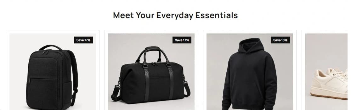
Read the Ecomfella theme overview, inspect the real product demo and use the package comparison to evaluate the remaining work. One licensed Shopify store per store seat. Upload the delivered ZIP as an unpublished Shopify theme. Review before publishing it yourself.
Questions before you decide
Does a bigger menu improve search rankings?
Not by itself. Clear crawlable links and useful destination pages help discovery; decorative size is not an SEO advantage.
Can I use hover only?
No. Touch and keyboard users need an explicit, operable control and access to the same destinations.
Bring this checklist to the theme.
See the real layouts and controls before deciding whether they fit your products. No theme purchase or delivery is enabled in this Preview.
Explore the real themeSources and review
Primary provider documentation reviewed on 2026-09-13. Features and policies can change; confirm the selected release and current provider terms. The Ecomfella media comes from the existing unpublished marketing-showcase evidence library.
Continue with the next question
A Shopify theme for a large catalogue starts with discovery.
shopify collection page design
All storefront guides and tools