Shopify collection-page design: help people narrow the choice
A collection is a decision surface, not just a grid of images.
A useful collection page tells shoppers where they are, shows comparable products and helps them narrow the choice. Start with the catalogue structure and product information. Add banners, category shortcuts and merchandising only when they help a shopper reach a relevant product sooner.
Make the category useful before styling the grid
Choose a collection name that matches how customers describe the products. Decide whether the page groups a product type, an occasion or a campaign. Mixing those purposes without explanation makes it difficult to know what belongs in the collection. Use a short introduction only when it clarifies the selection.
For example, an accessories catalogue might separate everyday bags from travel bags because the buying requirements differ. A small catalogue might need fewer divisions. This is a planning example, not proof that a particular niche page or catalogue size has been tested with Ecomfella.
Make product cards easy to compare
Use a consistent image treatment and enough naming detail to distinguish similar items. Show prices clearly and reserve labels for information that is accurate and useful. A row of competing sale badges can make the actual differences between products harder to see.
Check a long title, a product with options and a product that is not available. Decide whether a quick-buy action gives enough context for the particular item. A product that requires fit or compatibility decisions may be better served by opening its full product page first.
| Element | Useful purpose | Review question |
|---|---|---|
| Collection banner | Explain the selection or campaign | Does it delay the first useful products on mobile? |
| Category navigation | Offer a meaningful narrower route | Do the labels match the catalogue? |
| Product grid | Support side-by-side comparison | Are images, titles and prices consistent? |
| Promotional placement | Explain a relevant offer | Are its conditions clear and current? |
| Filtering and sorting | Reduce a large choice set | Are the options supported and populated with useful data? |
Treat filtering as a data and compatibility task
Shopify documents storefront filtering through Search & Discovery, with supported themes and data requirements. A visually attractive filter is not useful if products are missing the values it needs. Check the actual theme version, catalogue data and applicable limits before promising a filtering setup.
Start with the attributes people really choose by, such as a relevant size or material. Do not add filters simply because the interface can display them. Test a selection that returns few products and one that returns none, then make sure the customer can recover without starting over.
Use the Ecomfella collection system deliberately
The Ecomfella inventory includes product grids, collection lists, promotional collection layouts and category navigation. The real storefront captures show how photography and a product selection can share a coherent visual direction. They do not prove the performance of an arbitrary large catalogue or every third-party search app.
Choose a layout around the catalogue task. A campaign-led collection may need an opening image; a returning shopper looking for a replacement item may need products immediately. Keep your brand styling consistent with the product page and cart so browsing does not feel like moving between unrelated sites.
Follow the route from navigation to product
On mobile, begin at the main navigation and find the collection without relying on a direct link. Select a product and return to the collection. Check whether the selected filters, scroll position and page context behave as expected in your actual setup. Test the available space with real browser controls and larger text.
Review the collection’s title, descriptive copy and internal links for clarity. Do not repeat the same keyword in every heading or create many near-identical categories only for search traffic. A useful collection earns its place by helping customers choose, not by adding another URL.
- Clear category name and navigation route.
- Products visible without an oversized empty introduction.
- Consistent card imagery and legible prices.
- Filters backed by accurate product data.
- Useful empty state and clear way to reset filters.
- Product and cart experience consistent with the collection.
See the decision in the real theme
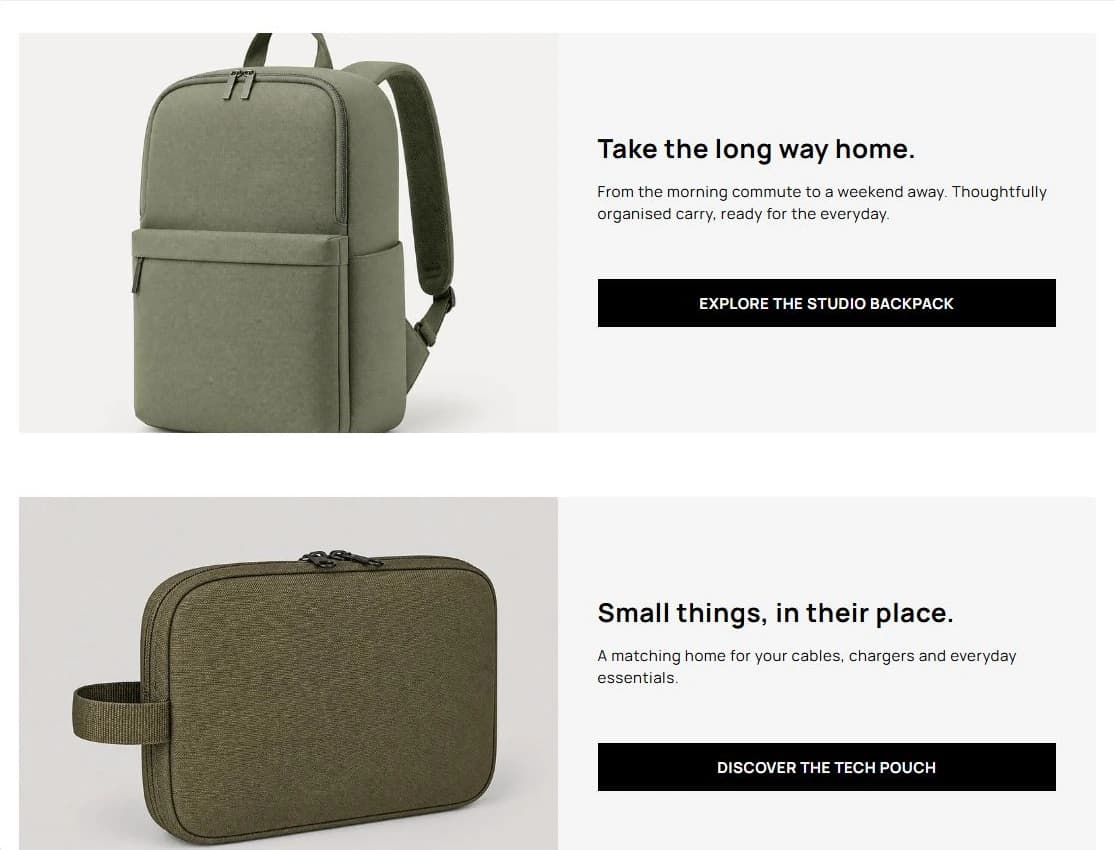
Use the Ecomfella theme overview as the product reference, then inspect the real demo and current package comparison. A guide is not a substitute for checking your own catalogue, release and integrations.
- Installation
- Upload the delivered ZIP as an unpublished Shopify theme. Review before publishing it yourself.
- Store licensing
- One licensed Shopify store per store seat.
- Updates
- Review supported releases in the Buyer Portal. Updates do not automatically overwrite your live theme.
Put the guide next to the product.
Inspect what is included, then decide whether the theme fits your store. Preview content does not open sales or grant account access.
Explore the storefront demoSources and review
External product details were checked on 2026-09-13. Provider documentation can change. Ecomfella examples use the current marketing evidence library; development files and future products are not a promise of delivery.
- Shopify: templates and collection pages — checked 2026-09-13
- Shopify: storefront filtering — checked 2026-09-13