Shopify product-page sections: answer the buying questions
Build the page around what a shopper still needs to know.
Start a product page with recognition, price, choice and a clear buying action. Add sections in the order of the shopper’s unanswered questions: what it is, whether it fits their needs, how it works, what delivery involves and what credible evidence supports the decision. More blocks are not automatically more useful.
Give every section a buying question
For a backpack, the initial questions might be capacity, dimensions, material and what fits inside. For clothing they might be size, fit and care. Use those questions to decide section order. A dramatic campaign banner that repeats the product title may be less useful than a clear image showing the interior.
Keep the buying area compact enough that related information remains connected. Put the selected variant, price and buying control where they can be understood together. Place supporting details nearby when they affect the choice. Longer editorial material can follow once the basic product is clear.
| Question | Useful content | What to avoid |
|---|---|---|
| What is it? | Recognisable media and a precise product name | A slogan instead of product identification |
| Is it right for me? | Dimensions, fit, ingredients or compatibility where relevant | Generic benefit copy that avoids specifics |
| Which one am I buying? | Clearly labelled choices and selected state | Colour alone as the only selection cue |
| What happens next? | Accurate delivery and returns information | Unqualified shipping or availability promises |
| Why trust this? | Real evidence you have permission to publish | Invented reviews, badges or results |
Understand templates, sections and blocks
Shopify templates organise the sections used for a type of page. A product-information section can contain smaller blocks. The available settings are theme- and version-dependent. Before creating a new template for every product, decide which products share the same content structure and which genuinely need another layout.
Use product-specific information instead of copying one product’s details into a shared template. If you use dynamic sources, verify the supported field and block connection in your own theme. The fact that Shopify supports a capability does not prove that every delivered section accepts every data type.
Use Ecomfella’s product proof as a starting point
The Ecomfella product capture shows media and a buying area together. The current product inventory describes blocks for product context, choices, stock and delivery, trust and related offers. Use the Features page and product tour to inspect the actual controls and layouts rather than assuming every block belongs on every product.
Keep the final composition selective. A technical item may need detailed specification content; a simple accessory may need only a few concise answers. Demo content is a layout example, not customer evidence. Replace any review or promotional material with information that is true for your business.
Review the decision on a phone
Read the page from the top without knowing the product. Is the first image useful at the available size? Does choosing a variant leave the chosen option obvious? Can the customer find the price and buying action without scrolling through unrelated promotion? Check long names and unavailable options, not only the shortest demo content.
Expand details, move through media and open the cart. Test keyboard focus, text enlargement and slow loading. Keep essential information available without hover or animation. A product page should remain understandable when a decorative effect is absent.
A practical review before publishing
Ask another person to explain the product and its selected option after using the page. Where they hesitate, improve the information before adding another section. Record the unanswered question and the change that addresses it. This is more actionable than assuming a particular visual pattern increases conversion.
When the page feels complete, follow the same item into the cart. Product naming, options and amounts should remain consistent. Then check the collection route that brought the shopper here: the grid and product page should not tell different stories.
- One clear product identity and buying action.
- Accurate media, options and selected states.
- Product-specific specifications and delivery information.
- Only genuine proof and current offers.
- Mobile, keyboard and cart journey reviewed together.
See the decision in the real theme
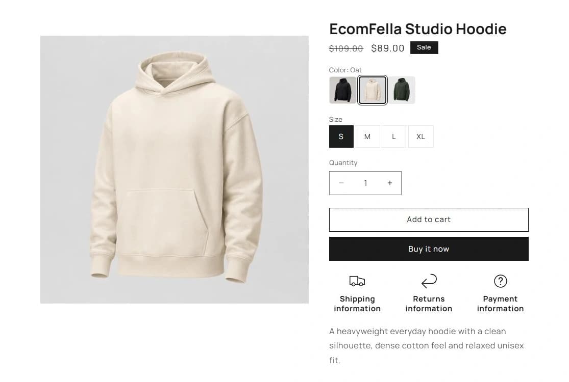
Use the Ecomfella theme overview as the product reference, then inspect the real demo and current package comparison. A guide is not a substitute for checking your own catalogue, release and integrations.
- Installation
- Upload the delivered ZIP as an unpublished Shopify theme. Review before publishing it yourself.
- Store licensing
- One licensed Shopify store per store seat.
- Updates
- Review supported releases in the Buyer Portal. Updates do not automatically overwrite your live theme.
Put the guide next to the product.
Inspect what is included, then decide whether the theme fits your store. Preview content does not open sales or grant account access.
See the product capabilitiesSources and review
External product details were checked on 2026-09-13. Provider documentation can change. Ecomfella examples use the current marketing evidence library; development files and future products are not a promise of delivery.
- Shopify: sections and blocks — checked 2026-09-13
- Shopify: templates — checked 2026-09-13