A Shopify cart drawer should clarify the next step
Keep the product decision intact all the way to checkout.
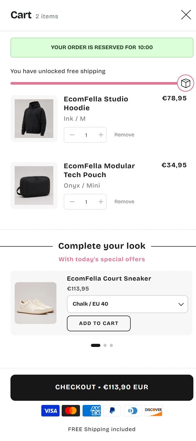
A useful cart drawer confirms what was added, makes changes easy and gives the shopper a clear next step. Start with accurate product and price information. Add shipping explanations or recommendations only when they make the decision clearer rather than pushing the checkout action out of view.
Build around confirmation and control
After an add-to-cart action, the shopper needs to recognise the item, selected option, quantity and current amount. The drawer should make that confirmation easy before showing another offer. Keep a path back to the product and an obvious way to continue shopping. If the drawer includes promotions, the customer should still be able to locate the cart contents immediately.
Treat pending updates and errors as part of the design. A quantity control may need to communicate that an update is in progress; the final state must match the real cart. Test rapid changes and unavailable quantities. A polished static screenshot does not prove these behaviours, so check them on the actual candidate theme.
Shipping messages are not shipping rates
A message such as “you are close to free shipping” is storefront communication. It does not create a shipping rate in Shopify checkout. Shopify shipping configuration determines the rates available for the relevant order and destination. A merchant must keep the message and the applicable rate rules aligned.
For example, a domestic threshold may not apply to an overseas address or every shipping profile. Avoid an unconditional promise when exceptions exist. Check an order below and above the threshold, with applicable discounts and a representative destination. Confirm the checkout result separately from the cart display. Editing cart copy is not a shipping-configuration change.
Give recommendations a job
Show an addition because it supports the product already chosen, not because the layout has a spare slot. A compatible accessory is a clearer suggestion than an unrelated best seller. Explain enough for the shopper to understand the relationship without forcing them to navigate away from the current decision.
Do not invent urgency, stock warnings or savings. A crossed-out price needs a legitimate basis and an offer needs accurate conditions. If you cannot maintain that information, a simpler drawer is the safer design. In Ecomfella’s Cart Studio you can compare real visual directions before choosing the amount of detail your catalogue needs.
Treat the drawer as a mobile task, not a smaller picture
Check a long title, a product with several selected options and enough items to make the contents scroll. The page underneath should not compete with the open drawer. Keep the close control and the buying action reachable. Do not hide essential totals beneath browser controls or assume every phone has the same available height.
Use a keyboard to open and close the drawer, navigate its controls and return to the triggering element. Test at a larger text size too. These checks assess your actual implementation; they are not a claim that every theme or app passes automatically.
- Empty cart, one item and a long cart.
- Quantity update, removal and unsuccessful update.
- Correct selected variants and product links.
- Discount and shipping-message consistency.
- Keyboard close, focus return and visible focus.
- Checkout remains reachable on a short mobile screen.
Choose the simplest drawer that supports the sale
An editorial brand may need a quiet summary, while a catalogue with compatible accessories may benefit from contextual recommendations. Neither is universally better. Compare the cart in the context of the product page so type, imagery and interaction remain familiar.
Ecomfella’s demonstrated cart directions are built into the theme. A visual direction is not an independent payments system, and choosing it does not change your Shopify checkout rates. Review the real Cart Studio, then test the selected implementation with your catalogue and installed integrations before publication.
See the decision in the real theme
Use the Ecomfella theme overview as the product reference, then inspect the real demo and current package comparison. A guide is not a substitute for checking your own catalogue, release and integrations.
- Installation
- Upload the delivered ZIP as an unpublished Shopify theme. Review before publishing it yourself.
- Store licensing
- One licensed Shopify store per store seat.
- Updates
- Review supported releases in the Buyer Portal. Updates do not automatically overwrite your live theme.
Put the guide next to the product.
Inspect what is included, then decide whether the theme fits your store. Preview content does not open sales or grant account access.
Explore the Cart StudioSources and review
External product details were checked on 2026-09-13. Provider documentation can change. Ecomfella examples use the current marketing evidence library; development files and future products are not a promise of delivery.
- Shopify Dawn: cart drawer source — checked 2026-09-13
- Shopify: shipping rates — checked 2026-09-13